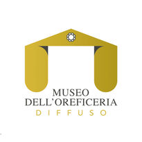
THE LOGO [MOD]
THE ROUND SHADOW
When I was given the assignment
for the creation of the brand for the Goldsmithery Museum
(which I first referred to as MUSEOR) I understood that,
among the various studied scenarios, a classic metaphysical entry
was the idea. The idea. The esprit to display;
a symmetrical and authoritative front, with a lean tympanum
resting, dissonant, on full-bodied columns.
~~~
The construction - 4 compass stakes, 2 for each column,
with a square area between the two, which is twice as much
of the width of each - avoids both columns
touching ground in a semicircle, ellipsoidizing
- with graphic license - the basis.
In the center of the tympanum the diamond eye.
~~~
But it is the shadow, the (almost) black shadow of the lying tympanum that,
although flat, magically three-dimensionalizes the columns.
It is the shadow that rounds.
And the Times Regular reads golden architecture.
From below, silent.
Èzio Campese
"I started with the logo Ezio drew on paper, it was first reproduced with a vector drawing program in order to ensure scalability. I then added the definition "D I F F U S O" (diffused") as an epigraph below the original logo, justifying it with the center of the columns.
From there, I defined a manual with proportions, associated typography, color codes, scalability and responsive versions, negative applications, and major corporate image formats.
Defining these rules will allow the logo to be easily usable and at the same time consistent and recognizable over time. The design is in the details."
Davide Fossati
NUVOLE


